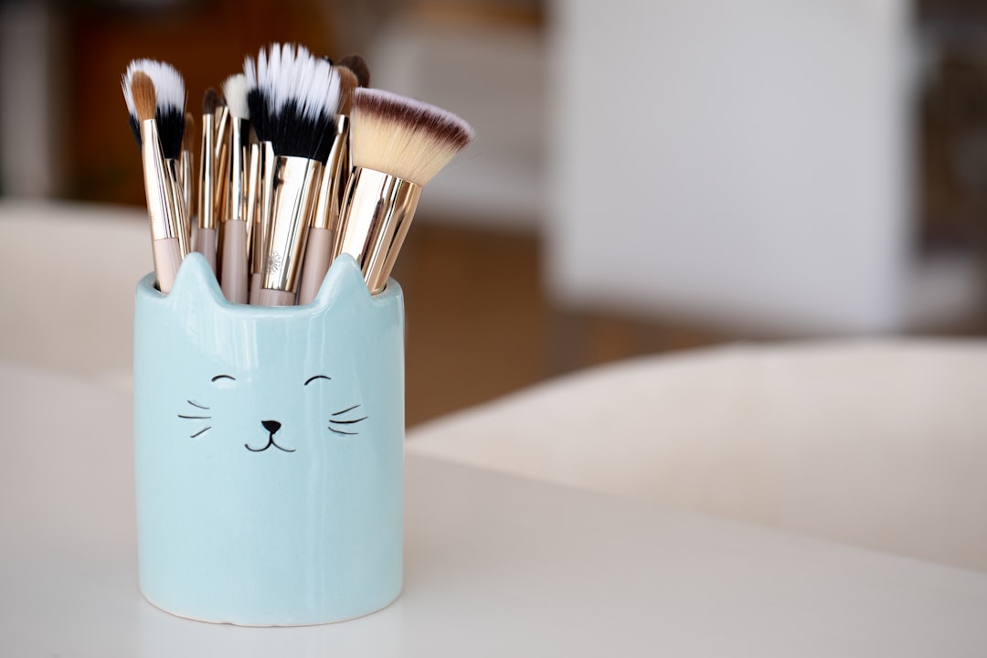
Color theory isn't just for painters and graphic designers—it's one of the most powerful tools in a visagiste's arsenal. Understanding how colors interact with each other and with different skin tones can elevate your makeup application from good to extraordinary. In this comprehensive guide, we'll explore the fundamentals of color theory and how to apply these principles to create harmonious, flattering makeup looks.
The Basics of Color Theory
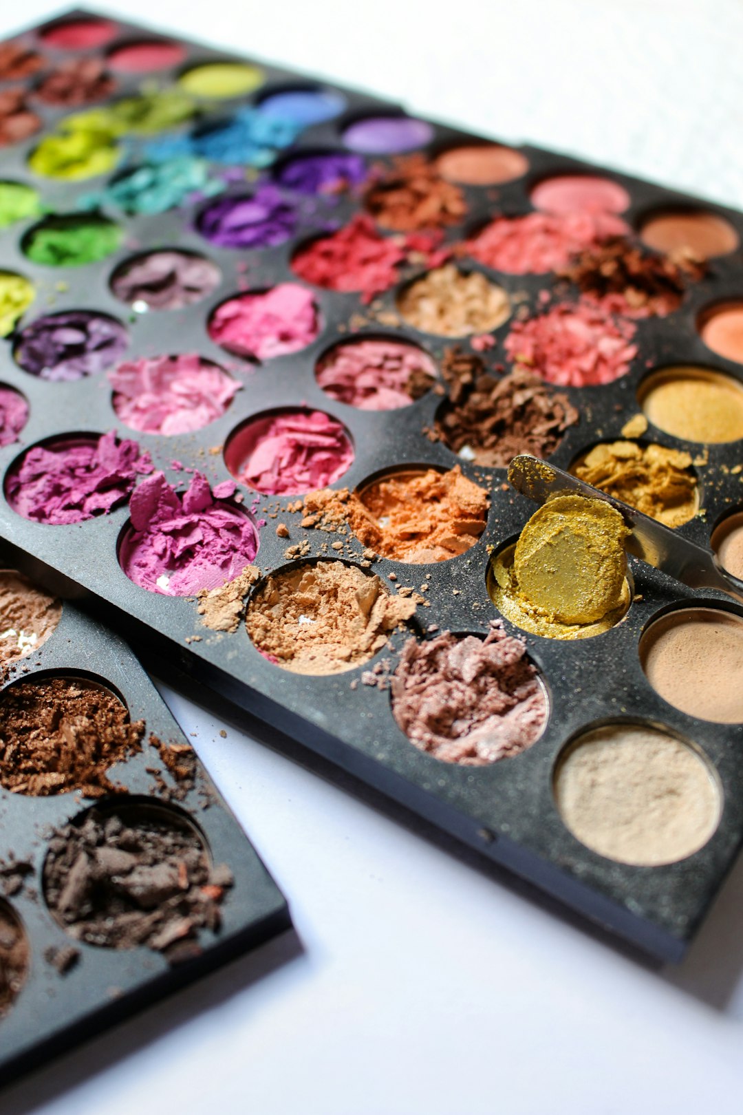
The Color Wheel
At the heart of color theory is the color wheel, a circular arrangement of colors that shows relationships between:
- Primary colors: Red, blue, and yellow—the basis from which all other colors are created
- Secondary colors: Green, orange, and purple—created by mixing primary colors
- Tertiary colors: Colors created by mixing primary and secondary colors
Understanding the color wheel helps you identify color relationships that can be used to enhance or neutralize features in makeup application.
Key Color Relationships
- Complementary colors: Colors opposite each other on the color wheel (e.g., red and green, blue and orange, purple and yellow)
- Analogous colors: Colors next to each other on the color wheel (e.g., blue, blue-green, and green)
- Triadic colors: Three colors equally spaced around the color wheel
- Monochromatic colors: Different shades, tones, and tints of a single color
"In 2030, makeup will transcend traditional boundaries, becoming a form of digital and physical artistry that adapts to one's emotions and environment. The visagiste of tomorrow will be both artist and technologist."— Future Beauty Trend Forecaster
Understanding Undertones
Before applying color theory to makeup, it's essential to understand undertones—the subtle hue beneath the surface of skin that affects how colors appear when applied.
Identifying Undertones
- Warm undertones: Golden, peachy, or yellow cast to the skin
- Cool undertones: Pink, red, or bluish cast to the skin
- Neutral undertones: A balance of warm and cool, or olive undertones
Quick tests to determine undertones:
- Vein test: Look at the veins on your wrist—blue veins suggest cool undertones, green veins suggest warm undertones, and blue-green suggests neutral
- Jewelry test: Notice whether gold (warm) or silver (cool) jewelry is more flattering against your skin
- White vs. off-white: Determine whether pure white (cool) or ivory (warm) is more complementary to your complexion
Color Theory in Practice: Makeup Applications
Color Correction
Color correction uses complementary colors to neutralize unwanted discoloration in the skin:
- Green neutralizes redness (acne, rosacea, irritation)
- Purple neutralizes yellow tones (sallowness, bruising)
- Orange/Peach neutralizes blue/purple tones (under-eye circles, veins, hyperpigmentation on deeper skin tones)
- Yellow neutralizes purple tones (bruising, dark spots)
- Blue neutralizes orange tones (extreme sallowness, fake tan mishaps)
Professional tip: Color correctors should be applied sparingly before foundation. The goal is to neutralize, not to add another layer of color that needs to be covered.
Enhancing Eye Color
Using complementary colors can make eye colors appear more vibrant:
- Blue eyes: Enhanced by orange-based shades like copper, terracotta, and warm browns
- Green eyes: Enhanced by purple-based shades like plum, mauve, and burgundy
- Brown eyes: Enhanced by blue-based shades like navy, cobalt, and cool purples
- Hazel eyes: Can be influenced to appear more green with purple tones or more brown with blue tones
Creating Harmony in Full-Face Looks
Monochromatic Looks
Using variations of a single color creates a cohesive, modern effect:
- Select a base color that flatters your skin tone
- Use lighter tints on the high points of the face (eyes, tops of cheekbones)
- Use deeper shades in recessed areas (crease of the eye, hollow of the cheek)
- Tie the look together with a lip color in the same color family
Professional tip: Monochromatic doesn't mean identical—play with texture and finish to add dimension within your chosen color family.
Complementary Color Looks
Using colors from opposite sides of the color wheel creates dramatic contrast:
- Choose one complementary color for emphasis (usually on the eyes or lips)
- Use the other color as an accent
- Balance with neutrals to avoid an overwhelming effect
Professional tip: When working with complementary colors, make one dominant and use the other more subtly for a sophisticated result.
Analogous Color Looks
Using colors adjacent on the color wheel creates a harmonious, blended effect:
- Select 2-3 neighboring colors on the wheel
- Create a gradient effect, perhaps on the eyes
- Keep the rest of the face neutral or in harmony with your chosen palette
Color Theory for Different Skin Tones
Fair to Light Skin
- With cool undertones: Soft pinks, lavenders, blues, true reds, and berry tones
- With warm undertones: Peach, coral, bronze, copper, and warm reds
Medium Skin
- With cool undertones: Rose, mauve, cool pinks, ruby, and plum
- With warm undertones: Golden brown, terracotta, amber, and warm oranges
- With olive undertones: Teal, bronze, copper, and muted purples
Deep Skin
- With cool undertones: Sapphire, emerald, fuchsia, and cool berry tones
- With warm undertones: Gold, copper, bronze, warm oranges, and rich browns
Professional tip: While these are general guidelines, don't be afraid to experiment. Some of the most striking looks come from unexpected color combinations.
Advanced Applications of Color Theory
Color Temperature
Beyond hue, understanding the temperature of colors allows for more nuanced applications:
- Warm colors (reds, oranges, yellows) tend to bring features forward
- Cool colors (blues, greens, purples) tend to recede
- This principle can be used for subtle contouring effects
Seasonal Color Theory
The "seasonal" approach to color analysis categorizes people into Spring, Summer, Autumn, and Winter types based on their natural coloring:
- Spring: Warm and bright colors
- Summer: Cool and soft colors
- Autumn: Warm and muted colors
- Winter: Cool and bright colors
While somewhat simplified, this system can provide a starting point for identifying your most flattering palette.
Cultural and Psychological Aspects of Color
Colors carry different meanings across cultures and can evoke specific emotions:
- Red: Passion, power, confidence
- Blue: Calm, trustworthiness, professionalism
- Green: Freshness, growth, harmony
- Purple: Creativity, luxury, spirituality
These associations can be leveraged when selecting makeup for specific occasions or to convey particular moods.
Practical Tips for Using Color Theory in Everyday Makeup
- Start with the eyes or lips as your color focus, then build the rest of your look around that choice
- Use the rule of thirds: one-third color impact, two-thirds neutral balance
- Consider the color of your outfit when planning your makeup
- When in doubt, a monochromatic look in your most flattering color family is always elegant
- Remember that lighting dramatically affects how colors appear—always check your makeup in the lighting where you'll be seen
Color theory in makeup is both science and art. While understanding the principles provides a strong foundation, developing an intuitive sense for color combinations comes with practice and experimentation. Don't be afraid to break the "rules" occasionally—some of the most memorable makeup looks challenge conventional color wisdom.
What's your favorite color combination to wear in your makeup? Do you have any unexpected color pairings that work surprisingly well for you? Share your experiences in the comments!